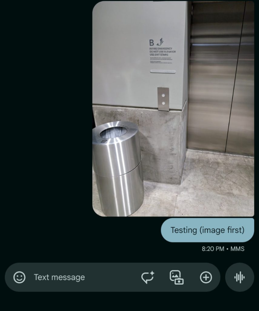


In a small but nice redesign, Google Messages is tweaking how photos sent with text appear in RCS conversations.
At the moment, sending an image and RCS message at the same time will see the text appear above the photo. In SMS conversations, the photo appears first with the text below it.
Google Messages is now testing a new design for RCS (and presumably SMS too). The picture will appear first with the message joined together by curving the bottom corners of the text bubble to match the top of the photo.


RCS (current) vs. RCS (new, u/seeareeff)
This merger looks nicer, while putting the text below makes a great deal more sense, especially in the context of captions. The current design always looked quite odd, so much so that you might want to see each item separately.
It matches the design of other messaging apps, which make adding an image caption a more explicit action.
So far, one user has reported this redesign for photos in Google Messages.

SMS (current)
FTC: We use income earning auto affiliate links. More.